You can design a clean, professional blog without spending a cent. Pick a free platform and theme that fit your content, then shape colors, fonts, layout, and images to guide visitors’ eyes. Make sure pages load fast and look great on phones. Keep it simple, consistent, and focused—and I’ll show you step-by-step how to build each part for real impact.
Key Takeaways
- Choose a free platform and theme that match your content, technical comfort, and exportability, then pilot with a couple of posts.
- Pick a compact color palette, readable web-safe fonts, and a simple logo to create consistent, accessible visual branding.
- Create a flexible grid-based layout and a repeatable post template emphasizing headline, image, and clear call-to-action.
- Optimize for mobile speed: responsive images, touch-friendly navigation, limited fonts, and basic SEO (titles, meta descriptions, headings).
- Promote selectively through one or two channels, repurpose top posts, track performance with simple analytics, and iterate based on data.
Choosing the Right Free Blogging Platform
How do you pick a free blogging platform that actually fits your goals? You map the journey: sketch your content, growth plan, and technical comfort. Compare top blogging platforms by interface, speed, and modularity; open each dashboard and imagine your workflow. Prioritize user experience—clear editor, responsive mobile preview, simple media handling—so publishing feels fast and joyful. Check integrations: social sharing, analytics, and export options that let you scale without vendor lock-in. Look for active communities and documentation that shorten your learning curve. Test for performance and accessibility; slow load times or clunky navigation will chase readers away. Consider ownership: can you export posts and migrate later? Finally, pilot two platforms with a short series of posts and measure engagement, editing flow, and maintenance overhead. That hands-on comparison reveals which free platform aligns with your creative rhythm and long-term ambitions. Make choices that keep iteration fast and costs minimal.
Picking a High-Quality Free Theme or Template

When you pick a free theme, picture your homepage, post, and mobile views so you can quickly judge if the design supports your content and workflow. Aim for a theme that balances clarity and flexibility: clean grids, readable typography defaults, clear calls-to-action, and predictable navigation. Scan demos with content types—longform posts, galleries, or tutorials—to confirm layout options and responsive behavior. For theme selection, prioritize performance, regular updates, and accessible markup; these reduce future redesign friction. Check plugin compatibility and built-in widgets so template customization stays intuitive without code. Test load times and image handling on slow networks. Choose themes with modular sections you can reorder, and prefer templates that expose spacing and layout controls rather than forcing fixed styles. Install two candidates, import demo content, and try publishing a draft to see real fit. Pick the one that minimizes tweaks while letting you iterate as your blog evolves.
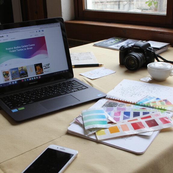
Customizing Colors, Fonts, and Brand Elements
Start by picking a simple color palette — two neutrals and one or two accent colors to set mood and readability. Then choose web-safe fonts that contrast for headings and body so text stays crisp on any device. Finally, create a compact logo and a set of small icons that echo your colors and scale cleanly for headers and social thumbnails.
Choose Color Palette
Because color shapes first impressions, choose a compact palette that reflects your blog’s personality, improves contrast, and guides readers’ eyes to calls to action. You’ll start by selecting a dominant hue that matches your voice, then add one or two accent colors for emphasis. Use color psychology to pick tones that evoke the mood you want — energetic, calm, or authoritative — and test combinations in real layouts.
Aim for color harmony: balance saturation and lightness so backgrounds, text, and buttons read clearly on any device. Limit variations to keep a cohesive identity. Create quick swatches and apply them to headers, links, and CTAs. Iterate based on feedback and metrics to refine a palette that’s bold, usable, and uniquely yours. Make small tweaks regularly for peak engagement.
Pick Web-Safe Fonts
Typography anchors your blog’s personality and readability, so pick web-safe fonts that render consistently across browsers and devices. You’ll choose two complementary families: a clear sans for headers and a neutral serif or geometric sans for body text. Test font pairings for contrast, hierarchy, and line-length to guide the eye. Prioritize readability factors: size, weight, letter-spacing, and line-height — they determine comfort on mobile and desktop. Stick to widely supported families (system stacks, Google Fonts’ popular options) to avoid surprises. Preview headings, captions, and buttons in real content. If you want an innovative edge, tweak scale and micro-animations rather than exotic fonts. Keep a simple fallback list in CSS so your design stays intentional when a font can’t load. Document choices for future consistency.
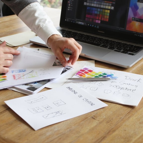
Design Logo and Icons
When you craft a logo and icon set, tie colors, fonts, and markups to the visual system you already chose so every element reads like the same brand. Start by sketching simple shapes that scale — a mark must work tiny or on a header. Lock two main colors and a neutral, then apply them to your logo design and icon creation for consistent contrast. Choose one display font for headlines and one geometric for small labels so typography supports the mark. Export SVGs for crisp icons and a PNG for general use. Test icons at 16px, 32px, 64px and refine strokes. Keep forms distinct, purposeful, and minimal; innovation comes from clarity, not ornament. Iterate quickly, seek feedback, and document guidelines for consistent future updates.
Designing Layout, Menus, and Post Templates
Sketch a clear grid for your pages so content, images, and white space line up across screens. Place menus where users expect them—top bar for primary sections, sticky or hamburger for mobile—so navigation feels instant. Set a simple post template that follows the grid and highlights the headline, hero image, and call-to-action.
Layout and Grid
Grid systems give your blog visual rhythm and clear hierarchy, so you can place menus, sidebars, and post templates where readers expect them. You’ll start by defining a flexible grid structure that adapts to screens: columns, gutters, and breakpoints that guide content flow. Apply layout principles like alignment, proximity, and consistent spacing to create predictable reading paths. Use modular cards for posts, let images span multiple columns for emphasis, and reserve negative space to highlight calls to action. Prototype quickly with free tools or CSS frameworks, testing how blocks rearrange on mobile. Iterate based on performance and reader feedback, prioritizing clarity over ornament. The result is a lean, modern layout that feels intentional and scalable. You’ll ship faster and keep evolving with data regularly.
Menus and Navigation
Having set a responsive grid that defines where content lands, you’ll map how readers move through it with clear menus and navigation. Prioritize a simple menu structure: primary topics, search, and calls-to-action aligned to the grid. Use visual cues—icons, spacing, micro-animations—to show state and guide attention without clutter. Build a logical navigation hierarchy so users reach content in three taps or fewer; group related pages under descriptive parent items and collapse deep links into progressive disclosure. Keep labels short, use consistent placement across breakpoints, and test on real devices. For innovation, experiment with contextual menus that change by section, but keep fallback anchors. Iterate from analytics and heatmaps, pruning seldom-used items to sharpen discovery. Measure click paths, refine labels, and reduce cognitive load continually.
Adding Images, Media, and Free Design Resources
When you place images and media deliberately, they steer the eye, break up text, and make your posts feel alive; pick visuals that support your message and load quickly. You’ll choose strong image sourcing and smart media usage: stock libraries, creative commons, and simple graphics that clarify ideas. Lean into contrast, mood, and scale so each visual guides attention.
- Use free stock (Unsplash, Pexels) with clear attribution.
- Create simple banners and icons in Canva or Figma.
- Embed short clips or audio that amplify a point.
Keep assets organized in folders and name files for searchability. You’ll favor formats that retain quality without excess weight. Try color overlays, consistent aspect ratios, and minimalist captions to connect visuals to text. Experiment with templates from free design resource sites to iterate fast. Your blog will feel modern, purposeful, and uniquely yours without spending a dime. Keep iterating daily.
Ensuring Mobile Responsiveness and Fast Loading
Small screens and slow connections can undo careful visual choices, so you’ll design with speed and adaptability in mind. Focus on a responsive grid, fluid images, and touch-friendly navigation so layouts reshape cleanly across devices. Apply mobile optimization techniques: prioritize content, collapse sidebars, and load above-the-fold elements first. Choose a lightweight theme, limit custom fonts, and serve scaled images to cut payloads. Use lazy loading and defer noncritical scripts; these speed enhancement strategies trim milliseconds and keep interactions snappy. Compress assets with gzip or Brotli and leverage browser caching for repeat visitors. Test on real devices and emulators, and measure load times with network throttling to simulate constrained connections. Keep buttons large, text readable, and tap targets spaced for accessibility. Iterate quickly: collect feedback, fix layout breaks, and refine resource delivery. When you design this way, your blog feels modern, fast, and effortless on any device everywhere, too.
Basic SEO, Analytics, and Promoting Your Content
If you want readers to find your posts, treat SEO as a map, analytics as a compass, and promotion as the trail you blaze—use simple on-page SEO (clear titles, descriptive meta, and structured headings), add basic analytics to track what’s working, and promote strategically through one or two channels that fit your audience. Focus on keyword research for each post, craft useful headings, and optimize images so pages load fast. Install lightweight analytics tools to monitor traffic, behavior, and conversions; use that data to iterate. For promotion, pick channels where your audience engages and push focused content promotion rather than scattershot sharing. Build credibility through link building and genuine audience engagement: respond to comments, join niche communities, and repurpose high-performing posts. Simplify steps to subscribe or share. Measure with analytics tools and scale what moves metrics.
Treat SEO as a map, analytics as your compass, and focused promotion as the trail you blaze.
- Clear title + targeted keyword research
- Measured content promotion and A/B ideas
- Link building, replies, and community focus